« March 2017 | Main | June 2017 »
May 30, 2017
Initial impressions of an Apple Watch holdout
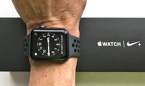
So I finally got an Apple Watch. Series 2, the one that's waterproof and has onboard GPS. I chose the larger one with the 42mm screen. When you need reading glasses every millimeter counts. That meant a $400 investment for a bottom-of-the-line watch with the aluminum case (as compared to the much more expensive stainless steel and ceramic ones). I picked space-gray with a black Nike sport band.
What took me so long? I am not sure. As a native Swiss I love watches and there were times in my life where I collected them. And I love Apple. When Apple has something new, I almost always buy it right away. So why not the Apple Watch when it first came out?
Overall, a funny thing happened to watches. When I grew up and for most of my earlier life, everyone wore a watch. A watch was part of life. But that has changed. I see comparatively few people wearing watches today. And if they do, the watch seems more a fashion accessory or a status symbol than something that tells time, which is really all that watches do. Fact is, smartphones have replaced watches. And cars and almost any other gizmo. They all tell time. Sure, it takes a bit longer to reach for the smartphone than to simply glance at your wrist to tell time, but we have gotten used to it.
That still doesn't explain why I didn't get an Apple Watch when it first came out. Between loving watches, loving Apple and loving technology, I should have but I didn't. And it's not that I have some inherent issues with watches that tell more than time. I bought the Microsoft watch almost a quarter of a century ago. I had numerous Casio and Timex watches that did all sorts of things.
So why not the Apple Watch? I am not quite sure. I recall being underwhelmed after watching Apple's initial introduction of the watch. It looked sort of blah instead of new and supercool. It couldn't really do anything that I felt I really needed. 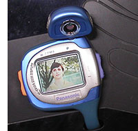 No Dick Tracy functionality there. And not even the promise of video calls that I'd seen in a Panasonic concept 15 years ago (see image to the right). Worst of all, the Apple Watch needed the iPhone to do much of anything. Why get something that makes you carry something else around? So I passed.
My wife finally got a Series 1 Apple Watch about a year after its April 2015 introduction. She was excited when she found that she could use the Apple Watch as a phone around the house. That meant there was no need to always have the iPhone with her, or trying to remember where it was. But using the Apple Watch as a phone quickly drains the battery. Apple claims up to 3 hours talk time. My wife is on the phone quite a bit, and the Apple Watch battery often didn't even make it past noon. She concluded that apart from being a conversation piece, the Apple Watch really couldn't do anything for her and so she stopped wearing it.
Then Apple introduced the Series 2 of the watch. Now the Apple Watch was waterproof, twice as bright, and had onboard GPS. That caught my attention. Waterproof to 50 meters (164 feet) and a brighter screen made it suitable for outdoor adventures. And onboard GPS meant you wouldn't have to take your iPhone along when jogging or running.
Waterproof to 50 meters ****
My interest cooled significantly when I found that Apple's idea of waterproof to 50 meters is very different from mine. To me it meant theoretically being able to take the watch on scuba, even past the recreational limit of 40 meters. To Apple it means the watch "may be used for shallow-water activities like swimming in a pool or ocean. It is also safe to wear it while showering or in a hot tub. However, Apple Watch Series 2 should not be used for scuba diving, waterskiing, or other activities involving high-velocity water or submersion below shallow depth." Truth be told, just like I never stuck my expensive iPhone in a waterproof case to take pictures and video while scuba diving, I wouldn't take a $400 Apple Watch underwater. But Apple's bombastic claim just rubbed me the wrong way.
So that left the onboard GPS. And that was what, in a spur-of-the-moment decision, made me finally get an Apple Watch. Getting a jogging GPS watch had been brewing in my mind for a while because I am a runner. Doing a good, exhausting run three times a week works for me and I've been doing it for many years. On top, I frequently run 5Ks. I keep track of my runs and performance with a dedicated running app on my iPhone. And have been holding the big iPhone 7 Plus in my right hand on many hundreds of runs. Not optimal.
Awesome packaging
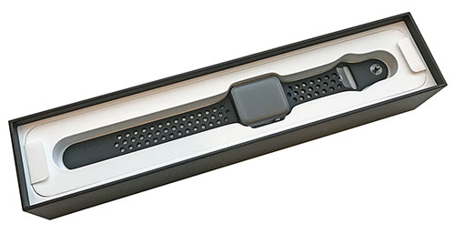
Getting any Apple product is exciting. Apple knows how to package and present. The black box the Apple Watch comes in is over a foot long and, empty, weighs a pound. That's a bit more than an iPad Air 2. Just for the box. And the Apple Watch is really quite attractive in a minimalistic way, sort of like a shrunken iPhone. The semi-matte anodized space-gray finish looked terrific. Instructions are minimal, too, as they are with all Apple products. After all, Apple products are so simple to use that instructions aren't needed.
Except that with the Apple Watch they are. Needed, that is.
That's because trying to figure out the relationship between the iPhone and the Apple Watch is more like working with iTunes (widely known as Apple's most cryptic, befuddling and recalcitrant piece of software).
This Apple product does need instructions
Apple's been working to portray the watch as more than just an adjunct to the iPhone. Onboard GPS and more apps that don't need the iPhone to run are a good start, but fact is that the Apple Watch remains almost fully dependent on the mothership iPhone for almost everything that goes beyond just being a watch.
That means becoming very familiar with the iPhone's Watch app that's used to set and configure and manage the watch. In essence, the iPhone acts like a server to the Apple Watch, or like the Cloud to a Chromebook. The watch can do some things, but it doesn't have its own internet access, and what can one do these days without internet access?
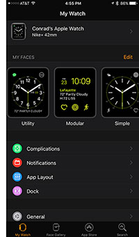 Unfortunately, very little is obvious on the Apple Watch and the watch-related software on the iPhone. It does start innocuous enough, with browsing various watch faces which, on top of basic watch functionality, can accommodate up to four additional functions, like showing battery charge, date, weather or icons to bring up favorite apps.
Complications???
What comes next is more complex and getting it right will make or break how useful the Apple Watch becomes.
It starts with "Complications". In Apple Watch lingo "complications" doesn't mean difficulties or being confronted with unexpected problems. Instead, the word refers to additional functions that can be shown on the watch face. Apparently, Apple chose the word because old-style Swiss watchmakers used it to describe anything that made the basic clockwork of one of their masterpieces more complicated. Using it on the Apple Watch is, well, absurd.
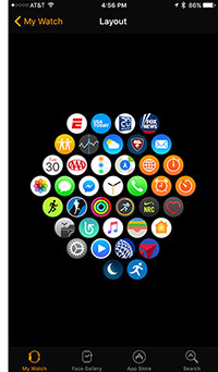
Next comes figuring out what sort of apps that aren't "complications" should also run on your Apple Watch. As is, some but not all of the apps resident on your iPhone have Apple Watch apps, and those all show up as installable. If you are not super-careful, they will all be installed, which means you'll end up with hundreds of tiny icons on your Apple Watch. You won't know beforehand what those apps will do or what they look like. If you tap it on the iPhone's Watch app, it will be installed. No explanations. Tapping again uninstalls it, but this seems a very inadequate method of figuring out what should occupy valuable real estate on the Apple Watch's limited memory and even more limited display real estate.
 But that's not all. For each of the apps you should then set what sort of notifications you want to receive on the Apple Watch. That's similar as on the iPhone where it's all too easy to be peppered with endless notifications all day long. Now THAT's a complication.
The iPhone Watch app also lets you play with the layout of all the icons that represent apps installed on the watch. This actually works a lot better than arranging icons on the iPhone itself. You can arrange the little watch icons any which way easily and we've seen some innovative layouts.
Finally, the Apple Watch also has a software dock. The dock serves the same purpose as the icon dock on a Mac or the fixed apps dock on the bottom of an iOS device: those are apps you want to access quickly without having to first locate them on some other screen or place.
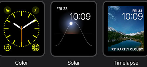
As far as user interface goes, swiping left and right brings up different watch faces that can include different "complications." That can come in handy if you use the watch for different purposes. For example, you could have a workout watch layout that shows heart rate and workout data, one that's for travel with time zones and airline app "complications," or one that's pretty and shows pictures from a special folder.
Swiping up shows the Control Center where you can set airplane mode and other modes (silent, do not disturb, theater, ditching water from the speaker after swimming, and more). Swiping down shows notifications that have come in. Some apps have "force touch" that bring up app-specific controls if you press hard. Pushing the crown toggles between watch face and icons, and press and hold brings up Siri. Turning the crown scrolls. A side button brings up the app dock. There's no multi-touch, but with a bit of practice, the interface is fairly easy to remember.
What is the watch doing? What does it need? How? When? Where?
Where it gets difficult and often quite frustrating is what the watch doesn't tell you. Simply put, the Apple Watch does things, but it almost always doesn't tell you what and how. With no pop-up windows to tell you what tapping a function does, and with no room for explanatory text on the small Apple Watch screen, using the watch is often trial and error. It's not obvious if there's a connection with the mothership iPhone or not, whether there's GPS reception, what apps may be sucking power in the background, how to close down such apps, whether or not the heart rate sensor is on or not or what its sampling rate is. And so on and so on and so on.
The Apple Watch OS is said to be much simpler and more intuitive than it was in its original version. Problem is that simplicity is a two-sided sword. If it's done well, a system simply works and you don't have to worry about a thing. But if necessary information is withheld for simplicity's sake and you never know what the system does, it can become quite frustrating. And that is, to me, the Apple Watch's biggest shortcoming. Or one of them anyway, for there are a few others.
So far, the good:
I am still in the early phase of getting acquainted with the Apple Watch. I've had it less than a week. So let's start with what I like:
The Apple Watch is a very cool watch. The 302 ppi 1,000 nits OLED display is definitely "retina," very clear, very sharp, beautiful. The display is off when I am not looking at it, but comes on with just the slightest delay when I flick my wrist up to look at the watch. My favorite watch face is a very simple analog one. The four "complications" (it's difficult to refer to this and not use quotes...) I use are remaining battery, day and date, weather summary, and the message icon.
The battery life is better than I expected after my wife's experience with her watch. I know now that some apps eat up battery just as they do on an iPhone. Stay away from those or use them sparingly, and the Apple Watch can run two or three days between charges. And it charges quickly (less than two hours from empty to full).
Though there isn't anything just yet that I'd consider a "killer app," some apps do come in handy. Since the watch is always on me, I have time, weather, and some important notifications on me, always; I don't have to first look for the phone. When wondering what to wear or expect, a glance at the watch shows me the temperature and likely weather. I see messages right away when they come in, I can read them, respond, and even see pictures, albeit without being able to zoom in to see more detail.
I can see how the various workout and health apps and functions Apple built into the watch can come in handy. Likewise, several other apps have potential, though it will take time and some effort to figure which ones and how they are best used.
And the not so good:
Unfortunately, there's quite a bit that I don't like or that leaves me underwhelmed.
The overall impression I have for now is that the watch just doesn't know (yet) what it is and/or wants to be. In that it reminds me of the initial iPhone which did not have apps as we know them now, just some minimal onboard functionality and the ability to look at websites that had special iPhone screens. That quickly changed and today the iPhone is a very powerful multi-purpose computer that no longer needs its own mothership (iTunes on a Mac or PC) to function.
After almost two years on the market, it seems that the Apple Watch has not reached that stage yet. Yes, there are apps that run on the watch, but their functionality is minimal and it's NEVER clear what connection to the iPhone app they should or must have to do what. I haven't seen anything on the watch that comes close to being a killer app. The watch remans an adjunct to the iPhone. That limits the watch to being of potential interest only to a relatively small fraction of iPhone users who feel like they also need an Apple Watch.
You could well argue that the iPhone itself really doesn't have a killer app that absolutely everyone must have and that has changed life as we know it. It's the overall usefulness of the iPhone that is its killer app. The iPhone has long since stopped being a "phone." The phone aspect is just a legacy leftover that telcos can still milk for a service few still rely on, making old-style dial-up phone calls. But the iPhone itself, as the Android smartphones it caused, is a new and incredible tool that we can no longer do without. The Apple Watch, on the other hand, uses a legacy form factor, the wrist watch, to somehow extend the iPhone, which really does not need extending.
But what about the health apps?
But what about the health and exercise aspect that Apple is pushing? That's certainly laudable. The Apple Watch comes with apps that are closely synchronized wth the main health app on the iPhone. And since the watch can record the heart rate which the iPhone can't, and since the watch can record movement much better since it's always on the body, there's definitely more information to monitor and manage health related functions.
But for that to really work, you have to wear the watch all the time, make sure everything is set up just right, have the iPhone handy, and then figure out what it all means, as the health app is quite a voluminous beast.
Health is certainly good, and if the Apple Watch makes more people aware of their health and what they can do to lead a healthier lifestyle, then that is a noble and worthwhile thing for sure. But it's definitely not a killer app as it is of potential interest only for the fraction of the population who has an iPhone, and of those the fairly small subsection that also have an Apple Watch, and of that contingent only the relatively small number of watch owners who are into using all the health functions, and use them religiously (because otherwise they are meaningless).
Why I got the Apple Watch
Just to reiterate, even though I am an Apple fan, a gadget lover, a watch lover, and I report on technology for a living, it took me almost two years to get an Apple Watch. And the reason that made me finally do it is because I thought it'd be great to no longer need to take the big iPhone 7 Plus with me when I go running, and to also record heart rate data. That is what made me buy the Apple Watch. For everything else, I was just fine with just the iPhone.
So what has been my experience with the Apple Watch to record my running? I don't know yet. Because I have not been able to get my running app, the one I essentially bought the Apple Watch for, to record my runs. That's a major disappointment and frustration. I know that the innovative developer of the exercise software I use spent much time in creating an Apple Watch app to go with their iPhone app (unfortunately that also made the iPhone app progressively more complex and much slower).
Yet, I can't get the running app to work on my new Apple Watch. It will search for a GPS signal, but when the message finally goes away, I have no way of knowing if GPS is now locked in or not, since the watch doesn't have an indicator for that. When I push the Start button on the app, nothing obvious happens, and when I wake up the watch upon finishing the run, the app says Start again, having recorded nothing. Or perhaps it did, for a while.
Although I like my running app very much and it's probably among the most used apps on my iPhone, I googled for alternatives and read their reviews. That was sobering. Most reviews are unclear on whether or not the watch apps run independently on the Apple Watch, or if they need the iPhone. Which makes a huge difference. I downloaded a few to see how they might work for me. Unfortunately, many apps these days force you to set up an account with them before you ever get to launch the app. All I want is collect data for myself and store it on my device, folks!
Inconclusive
So I remain undecided on the Apple Watch. It has, so far, certainly not replaced my iPhone as my running companion, and at this point I am not sure it ever will. I have not found anything on the watch that I totally need, or even that seemed of compelling use. As a watch, it's quite nice and it is a conversation piece. An expensive one, of course, but then again, millions of people spend far more on watches that can do far less. -- Conrad H. Blickenstorfer, conradb212@gmail.com
Posted by conradb212 at 9:14 PM
May 23, 2017
History repeats itself: it's now the Surface Laptop
So the long awaited Microsoft Surface Pro 5 has finally been unveiled as the "new Surface Pro." In its media release, Microsoft calls it "the next generation of the iconic product line and the most versatile laptop on the planet. The new Surface Pro delivers the most performance and battery life in a laptop that is this thin, light and quiet."
So right off the bat, Microsoft makes it clear that it now considers the Surface Pro a laptop and no longer a tablet. And just for good measure, within the first two paragraphs of the May 23 press release, Microsoft doubles up with calling the Surface 5 Pro "the Surface Laptop," "the ultimate laptop," "making the classic laptop feel fresh again" and talking about "the most versatile laptop" and "powerhouse laptop."
The message is super-abundantly clear. Laptop. Not tablet. Laptop. With a bit of sarcasm one might ask what took Microsoft so long this time to abandon the tablet. After all, mobile computing historians recall how quickly Microsoft absorbed early tablet initiatives over a quarter of a century ago as soon as the pesky PenPoint platform had been defeated, and how Microsoft's own 2001 Tablet PC morphed into convertible notebooks before the Tablet PC was even officially launched.
What does it all mean? To bluntly put it on the table: for the third time Microsoft has realized that Windows simply isn't a tablet operating system, and, for the role Windows plays on many hundreds of millions of desktops, it will most likely never be. Let's face it: with all of their myriad of functions, features and tiny controls, the Windows power apps are not tablet material. As long as the Windows legacy lives, and that may be for quite some time, using touch and pens for an OS and software culture that was designed, from the very start, around the mouse will never work.
Eventually that may change, but that won't be anytime soon. It's been five full years since Windows 8 was launched, and with all of Microsoft's might, the vast majority of the scarce touch-centric apps remain basic and fairly useless. Even under the latest version of Windows 10, touch is just a thin veneer on top of Windows as it's always been.
But what of the remarkable success of the Surface tablets? Microsoft hasn't been officially bragging about that as making its own tablet hardware really put them in direct head-on competition with their hardware partners whose business fortunes much depend on selling hardware for Microsoft's software.
It's easy to see why Microsoft was tempted enough to make its own hardware to actually go ahead with it. A good part of Microsoft's Windows problems is that the software is expected to run on whatever PC hardware it's installed. That means literally billions of possible permutations of hardware components. Compared with Apple, which makes its own hardware for its own software and has total control over it, that's a daunting challenge.
So why was the Surface so remarkably successful? Because Microsoft, for once, controlled both hardware and software, and took advantage of that to make really good tablets. And also because of the remarkable success of the tablet form factor in general.
But Microsoft is not stupid and has most likely been painfully aware that there's just no way that, given the gigantic Windows legacy behemoth hanging around its neck, Windows will ever work very well on tablets. As long as users stay in the "tablet mode" of Windows 10, things work marginally well, but those apps are really only sort of an Android Light. So even Surface users will likely spend much of their time in desktop mode with the keyboard and a mouse attached.
So why not go the "it's not a bug, it's a feature" route and rather than admitting that, as is, Windows isn't a good match for tablets, simply make the tablet more like a real Windows machine, like a laptop. Like the ultimate, most versatile, most powerhouse laptop. The Surface Laptop. One that works like a real old-style laptop with a decent keyboard, but one that, thanks to advancing technology and miniaturization can also be used as a tablet if the user comes across some truly touch-centric tablet software.
So there.
All that said, the specs, of course, look great. Kaby Lake all the way (conveniently precludes Windows 7), nice big 12.3-inch 2736 x 1824 pixel screen (really the same as the Surface Pro 4), impressive projected battery life, but rather costly ($2,199 with 16GB RAM and a 512GB SSD).
Just one thing. Though the Surface is now a laptop, it doesn't come standard with a keyboard nor a pen. Those are extras. Is a laptop without a keyboard still a laptop?
Overall, it's a bit odd.
Posted by conradb212 at 7:56 PM
