Will the Apple iPad Pro herald an era of “pro” use of tablets?
My iPad Pro came in and I want to share my first impressions, and also my thoughts on where all this is leading.
Anyone who first sees the iPad Pro will immediately notice its size. The iPad Pro is big. 12 x 8.7 inches versus 9.4 x 6.6 inches for the iPad Air 2. So the iPad Pro’s footprint is 68% larger than that of the standard iPad. Amazingly though, at 0.27 inches the iPad Pro is barely thicker than the iPad Air 2, which is 0.24 inches thick. And even more amazingly, the big iPad Pro is actually thinner than the sleek and slender iPhone 6S Plus (0.29 inches). In terms of weight, the iPad Pro comes in at a very manageable 1.57 pounds, just barely more than the original iPad, which weighed a pound and a half.
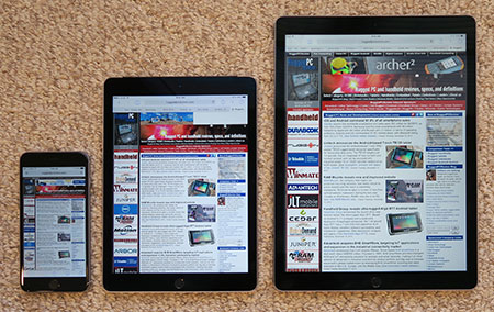
That said, its sheer size remains the iPad Pro’s most obvious feature. The picture below shows the (already rather large) 5.5-inch iPhone 6 Plus, the 9.7-inch iPad Air 2, and then the new iPad Pro with a diagonal screen size of 12.9 inches.

What about some of the other display specs? The 5.5-inch iPhone 6S Plus has 1,920 x 1,080 pixel resolution, which means 401 pixels per inch (ppi). The 9.7-inch iPad Air 2 weighs in at 2,048 x 1,536 inches, for 264 ppi. And the new 12.9-inch iPad Pro sports 2,732 x 2,048 pixels for the same 264 ppi. Super-sharp, all of them. And how bright are the displays? The iPhone 6S Plus is around 500 nits, the two iPads both around 450 nits. Plenty enough even for occasional outdoor use.
Setting up the iPad Pro was as simple as it gets. I backed up my iPad Air 2 to my iMac, then went through the setup process for the iPad Pro and selected “restore from backup.” That took less than 20 minutes. Then the iPad Pro came up and looked just like my iPad Air 2. But not totally. Only about 2/3s of my apps were loaded, the rest I had to restore from the Apple Store myself. And whatever required a password on the existing iPad required the password again on the iPad Pro. Else, everything was there. Kindle opened the book I was reading on the same page, and every webpage I’d had open on the iPad Air was also open on the iPad Pro when I first launched Safari. This ease of upgrading is something that I always loved about Apple.
I had feared that some apps might look terrible on the larger screen, the way iPhone apps looked terrible on the original iPad which had not only a much larger screen, but also much higher resolution. Since the resolution of the iPad Air 2 and iPad Pro is the same, nothing looks unusual, but many apps look sort of too spread out on the much larger screen.
You do get used to the larger display size very, very quickly. After a couple of hours of checking out apps and just doing my regular iPad routine, the Pro, while still feeling unquestionably large, felt right, whereas the iPad Air suddenly seemed to have shrunk.
But does one really need such a large screen? As is and for now, it seems like a luxury. The vast wealth of existing apps have all been designed and optimized for the 9.7-inch iPad display, so it’s not as if using the smaller screen was an inconvenience. Not in the way running classic Windows, designed for a big desktop display, can be a challenge on a small mobile device screen.
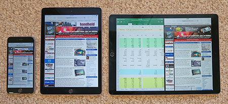
Where the larger screen will certainly come in handy is in split screen operation. Splitting the screen on the 9.7-inch iPad made for a lot of eye squinting and panning around. On the iPad Pro, working with two apps feels almost like having two iPads side-by-side. The picture below shows the iPad Pro in landscape mode with Excel and Safari side-by-side. Each half is plenty large enough for comfortable viewing.

Problem is, there aren’t many apps that support the full split screen yet. By full I mean 50-50 instead of just 2/3-1/3 (sort of like Microsoft introduced with Windows 8) that many apps are limited to. And sifting through an alphabetically ordered column of apps to pick the one you want in a split part of the screen is hardly the best way to get things done.
Another issue is that apart from the bigger size, there isn’t really anything “pro” about the iPad Pro yet. I searched for “iPad Pro” in the Apple store, but couldn’t find anything truly seemed to be for the iPad Pro, or take advantage of it. Not yet anyway.
One truly weird thing is that splitting a screen into two is sold and lauded as a marvelous technological advance. What?? For the past 30 years we’ve had as many resizable windows to work with as we wanted and needed, and now splitting the screen into two is news? No way.
There is, of course, the pen. Sadly, I’ll have to wait for mine another three weeks or so, although I ordered it together with my iPad Pro. I did get a chance to play with it in the local Apple store. There’s good news and not so good news.

The not-so-good news is much the same that sank the first generation of pen computers in the early 90s and limited adoption of the second generation in the early 00s. The Apple pen (Apple calls it “Pencil”) is very expensive (US$99), very large (bigger than a full-size pencil and with an oddly fat tip), and very easy to lose (it’s slippery, has no clip, and there’s no garage for it on the iPad). Worse, it needs a battery, which here means recharging it via the iPad’s port where it looks like it could very easily get damaged. And anything that must be charged will inevitably come up dead when you need it most.
All of the above, and a few other reasons, is why Steve Jobs was adamantly opposed to pens.
The good news, though, is that the pen works very well. Though the one I tried had somehow disconnected itself from its iPad and needed genius intervention, once the pen and tablet talked, the pen worked as smoothly and effortlessly as can be. Pressure results in thicker or thinner lines (hence probably “pencil”), the pen never falls behind, and the much advertised shading when you hold the pen at an angle is marvelous indeed. If all of this sounds the Apple Pencil is mostly for artists, that may or may not be so. I still love to jot quick notes on whatever scrap of paper is around, and with the right app scribbling away on the iPad Pro could be a boon. The question then is whether that’s enough of a use to justify a thousand dollar tablet and a hundred dollar pen.
Few remember today that handwriting recognition was the central concept of the first generation of pen computers. The idea was that everyone knows how to write, whereas not that many could type very well. So let’s replace that clunky old keyboard where you have to learn the layout of the keys with a simple pen. The computer then recognizes the writing, and no more need for a keyboard, not even onscreen. Sadly, that never really worked out. It worked for a few (including me), but no computer was fast and smart enough to make sense of the kind of careless scribbling most of us commit to paper. And editing via pen was a pain, too, almost as much as editing via voice (which is why pure voice recognition also isn’t winning any popularity contests).
But might useful handwriting recognition be a reason to have the Apple Pencil? That’s quite possible. Apple owns excellent intellectual property in the form of the “Rosetta” recognition technology of the late Newton MessagePad that became available as “Inkwell” in the Mac OS. Whether or not this will amount to anything on the iPad with its quick and easy tap-editing is anyone’s guess.
Final question: what impact will all of this have on rugged tablets? After all, Apple will likely never make a rugged iPad, and although many rugged cases are available for iPads, more than likely Windows and Android will remain the prevalent OS platforms in rugged computing devices.
The answer, I think, is that anything relating to screen size is worth watching. Trends towards smaller and larger display sizes in certain classes of mobile devices have always been quests for strategic advantage as much or more than technological progress (try to sell a phone with a 3-inch screen today!). And with both Microsoft and Apple (let alone Samsung) now using pens, pens may well regain a much more prominent position in mobile devices.
In closing this article, let’s not forget that we’re still very much in the midst of a software interface quagmire. Most of today’s productivity software was created for use with a mouse on a desktop. Yet, it’s a mobile world now where touch has replaced the mouse. Unfortunately, while panning, tapping, pinching and zooming work great in media consumption apps, they lack the precision mouse-era productivity software still requires. And that, my friends, is where the word “pro” ought to come into play. It’s not so much the size of the screen as it is how to work on it. And that issue remains to be resolved.